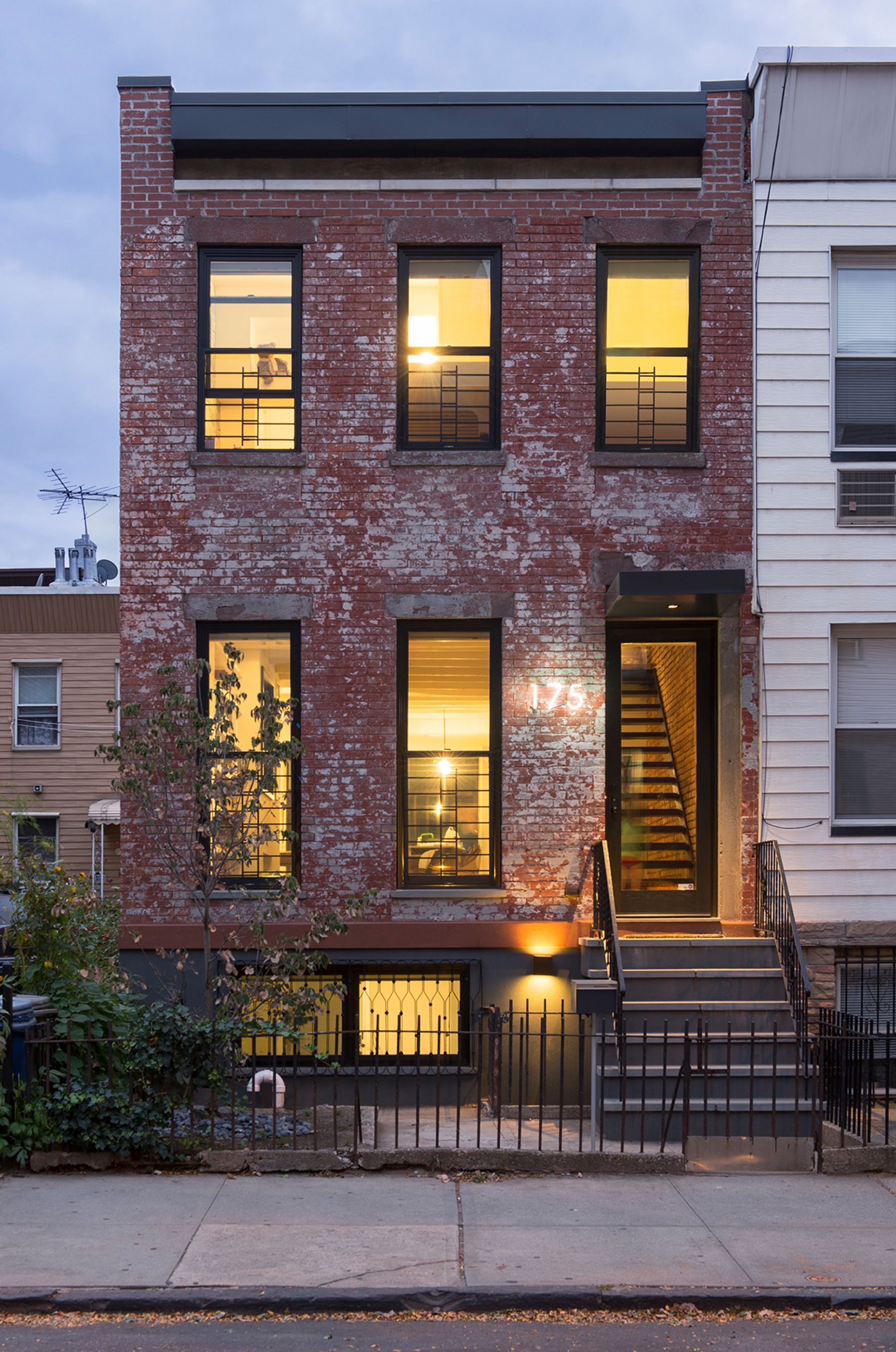
The primary design approach was to take advantage of the 'bones of the house' where possible by exposing the existing brick walls and the ceiling beams in the main floor. The new interventions were designed to highlight this existing archaeology.
m-ustic
The vision for the project was to marry the client’s two passions: modern simplicity + an unerring appreciation for the rustic qualities of the original house. This led to the invention of the term ‘m-ustic,’ which became a new architectural language for the project. Modern elements were treated as black, abstract insertions while the rustic qualities inherent in the house were restored and enhanced.
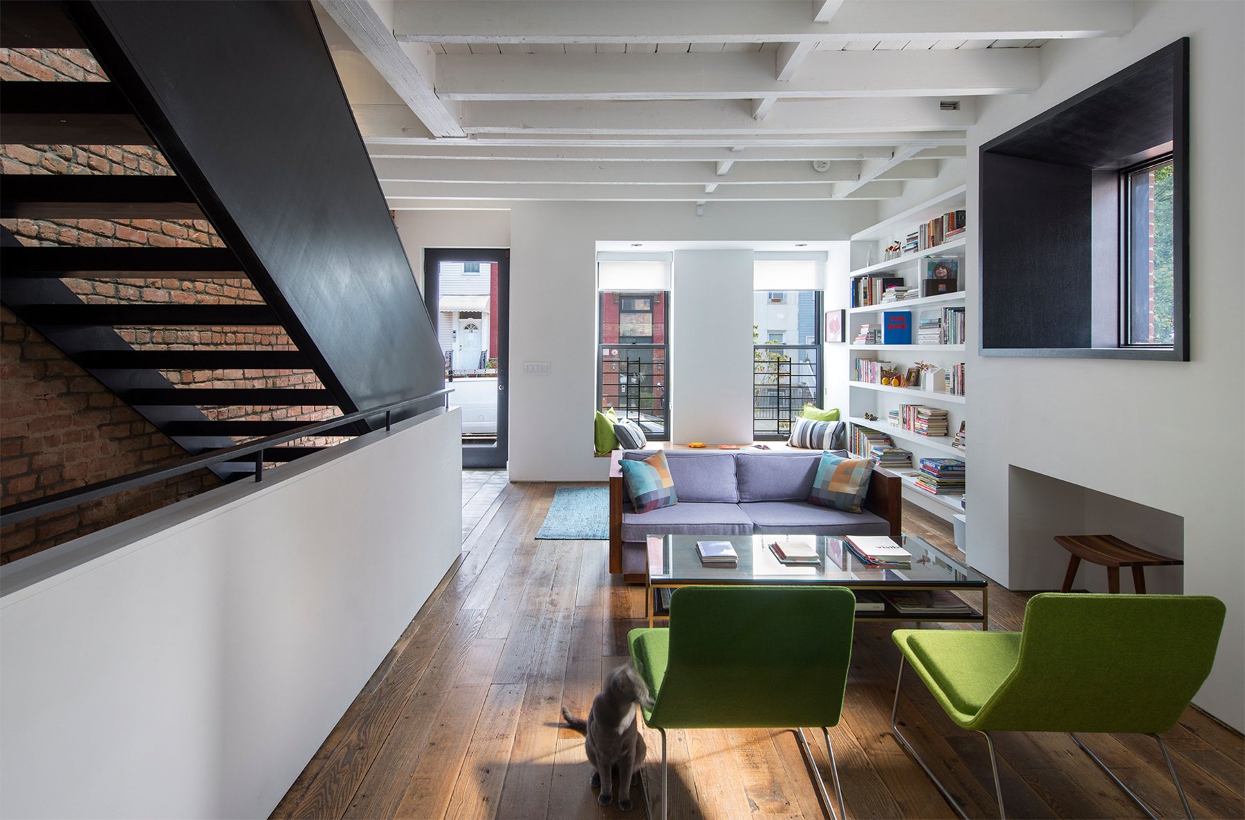
The blackened wood material palette delineates a PULL of forces that connect the circulation at the urban scale (street) to the circulation at the single family scale (stair).
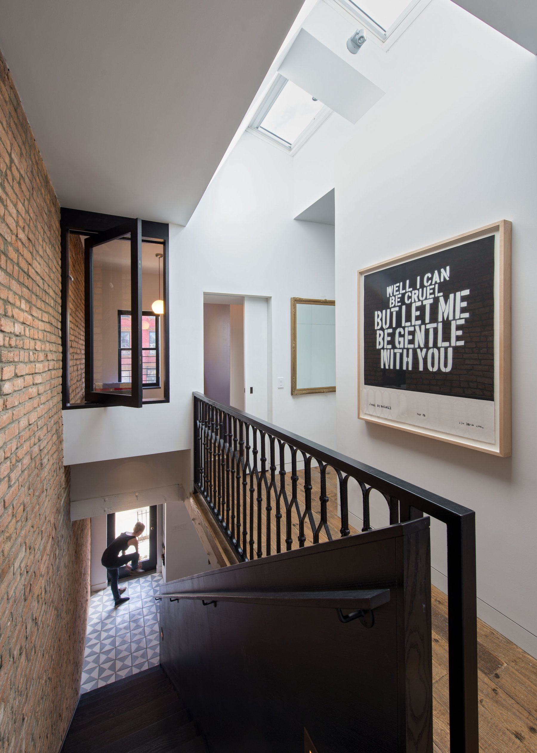
The skylight PULL tugs light from above to illuminate the brick party wall. The 'Romeo and Juliet' window opens to the skylight and preserves the continuity of the wall.
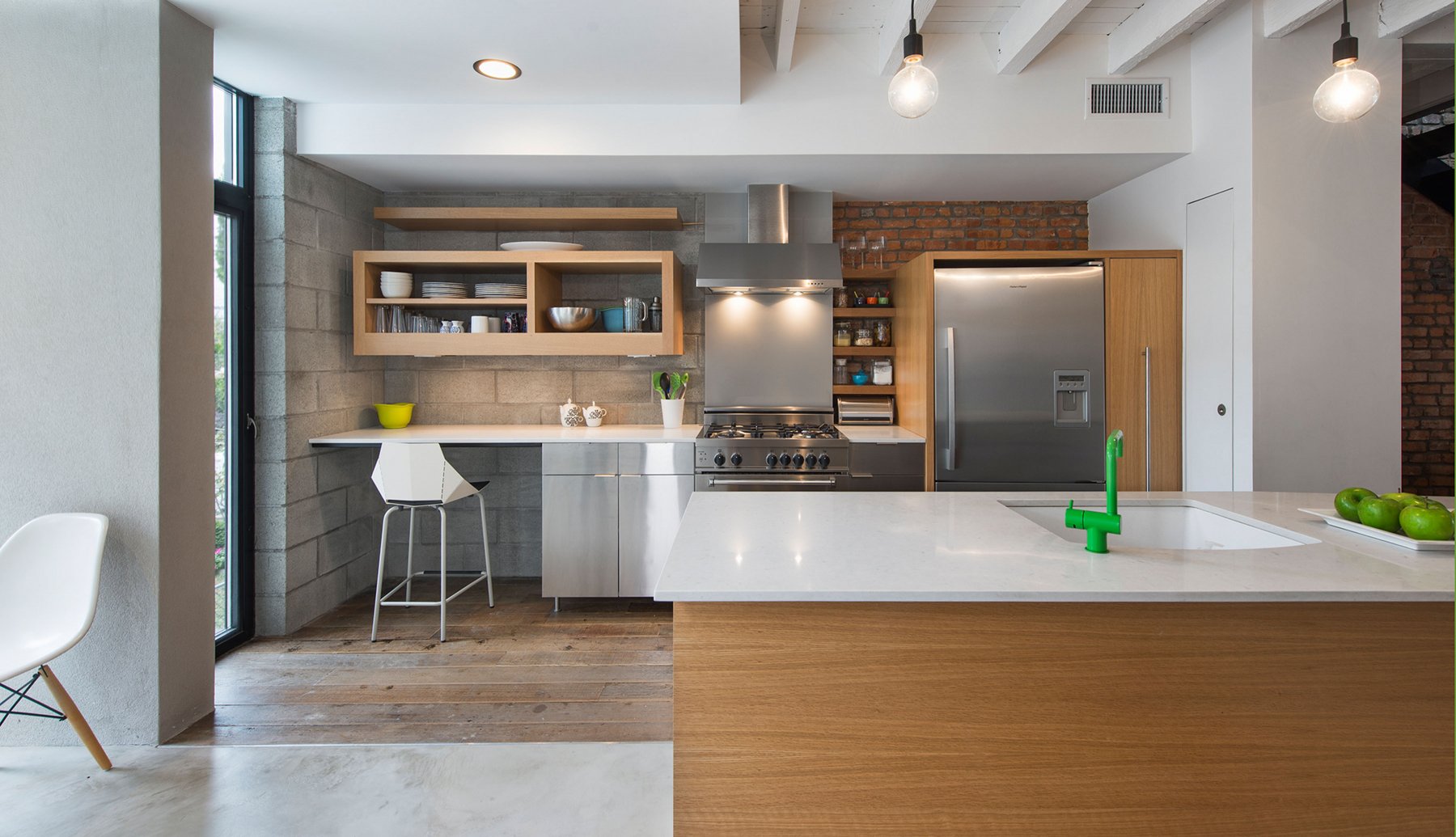
The kitchen is a combination of Ikea and custom built pieces.
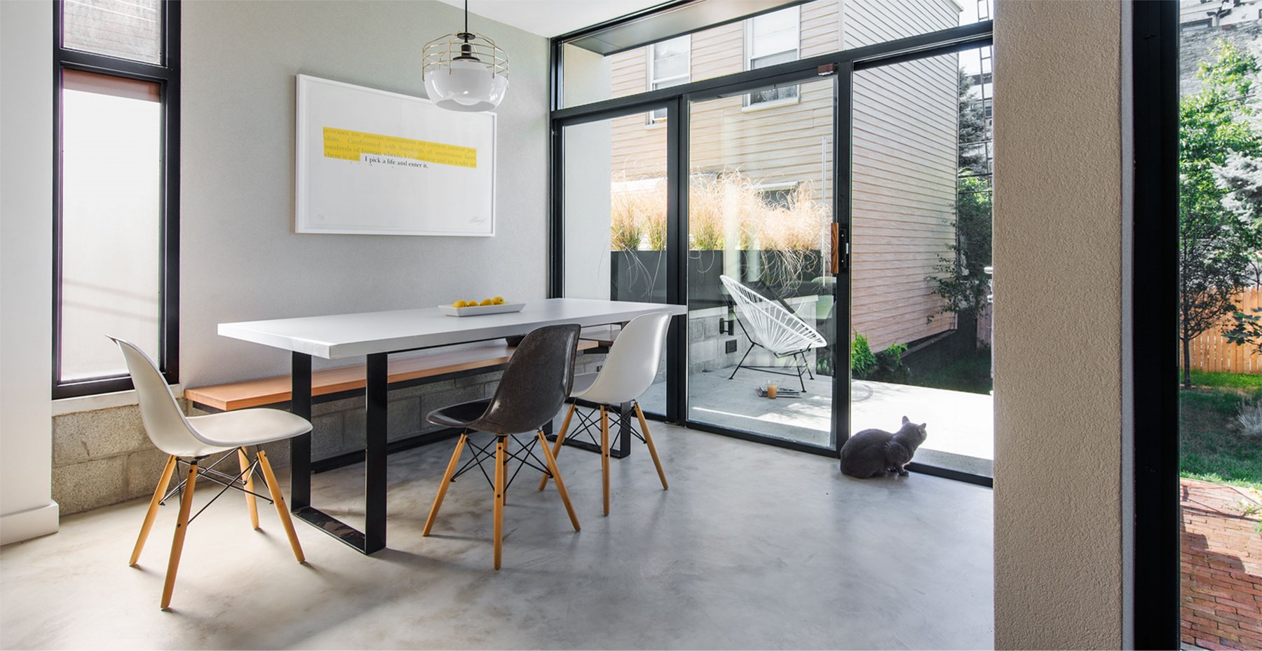
Marco the cat watches birds from the dining room extension.
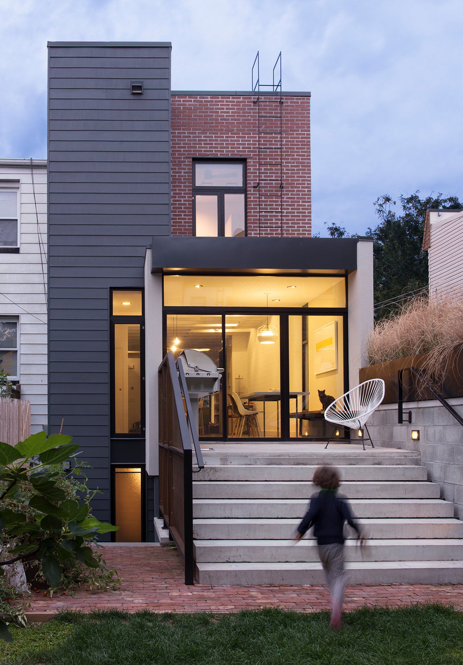
The garden is drawn into the interior through PUSHing the exterior material palette inside. The new tower anchors the addition.
recognition
- “Brooklyn Home Keeps its Historic Bones While Getting a Much Needed Interior Update.” The pushmi-pullyu home was noroof‘s second feature in Dwell magazine.
project team
- noroofers
- Kristin Washco–Emily Wetherbee
- affiliates
- Albanna Engineering–Mile Square Construction–Schematic Millworking
- photographer
- Chuck Choi